
提示词详情
Nano Banana 2 @astronomerozge1 Prompt: Under Armour performance campaign. Camera: Nikon Z9, 70mm f2, dramatic high angle then cut to extreme close-up composite. Color palette: electric blue, matte black, metallic silver. A woman exploding out of starting blocks on a track, captured at the exact millisecond of launch, full body tension, raw power. She wears black Under Armour RUSH compression set with subtle iridescent detail. Hair in tight braided ponytail. Expression: pure controlled aggression. Lighting: stadium floodlights with hard dramatic shadows, electric blue color grade, cinematic intensity. Motion blur on limbs, face tack sharp. Ultra-photorealistic, sports campaign quality.
探索更多
发现更多高质量提示词,从他人的创意中获取灵感。
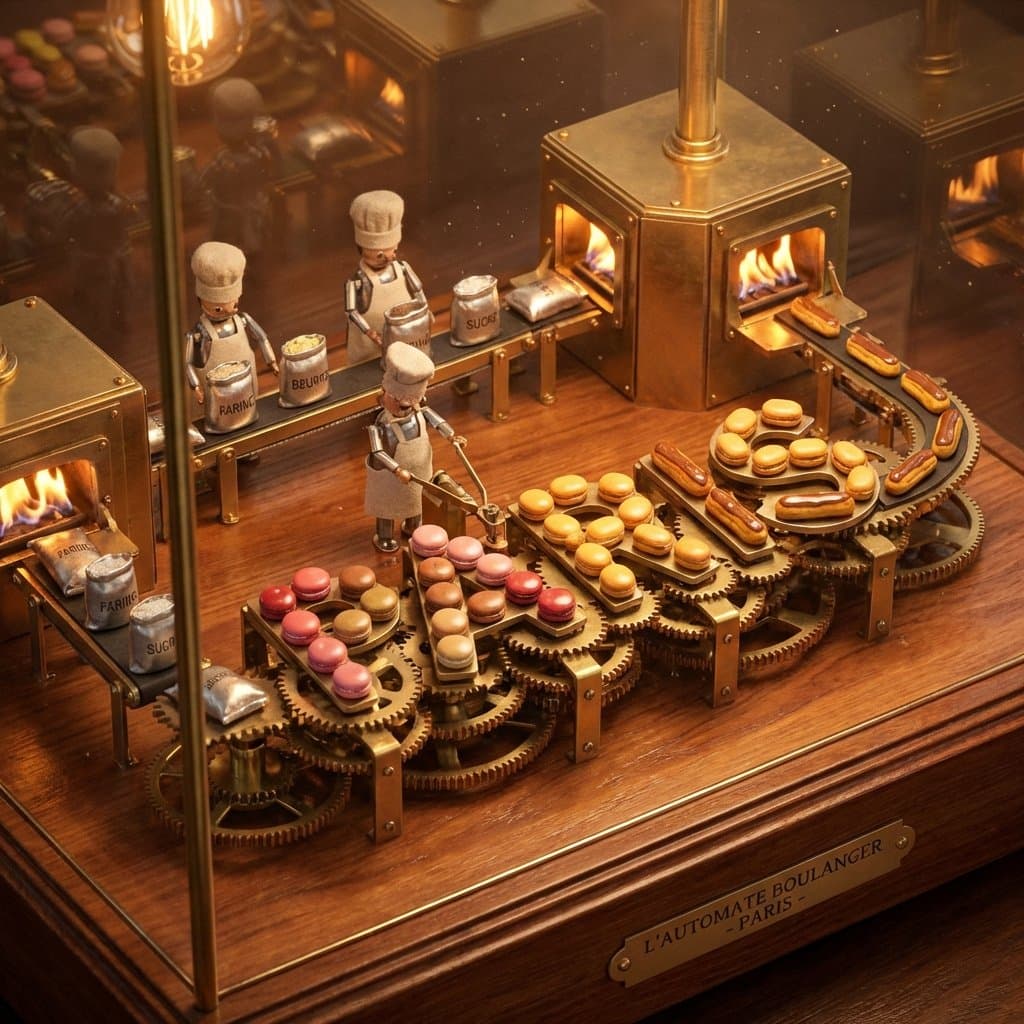
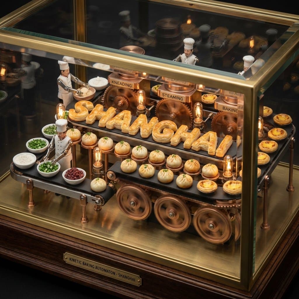
Pastry city concept. Fun experiment inspired by a food infographic I made a while back. do this for paris: kinetic baking automaton display concept: a mechanical wind-up diorama where the pastry city name assembles itself in perpetual motion through visible baking stages. input variables: [insert city name] [insert signature baked goods] [insert essential ingredients] [insert process steps] workflow: base setup: ornate brass-and-glass automaton on a wooden base with visible gears. core action/composition: tiny chef automata move [insert essential ingredients] through [insert process steps], gradually forming the rotating [insert city name] letters from [insert signature baked goods]. variants and details: pendulum ovens and conveyor belts delivering fresh pastries to complete each letter. narrative/interactive elements: endless cycle of creation turning raw ingredients into cultural icon. god-level details: warm tungsten lighting with motion blur on gears, polished metal and fresh pastry gloss, macro angled view, 8k hyper-realistic kinetic render with satisfying rhythm. </instructions>
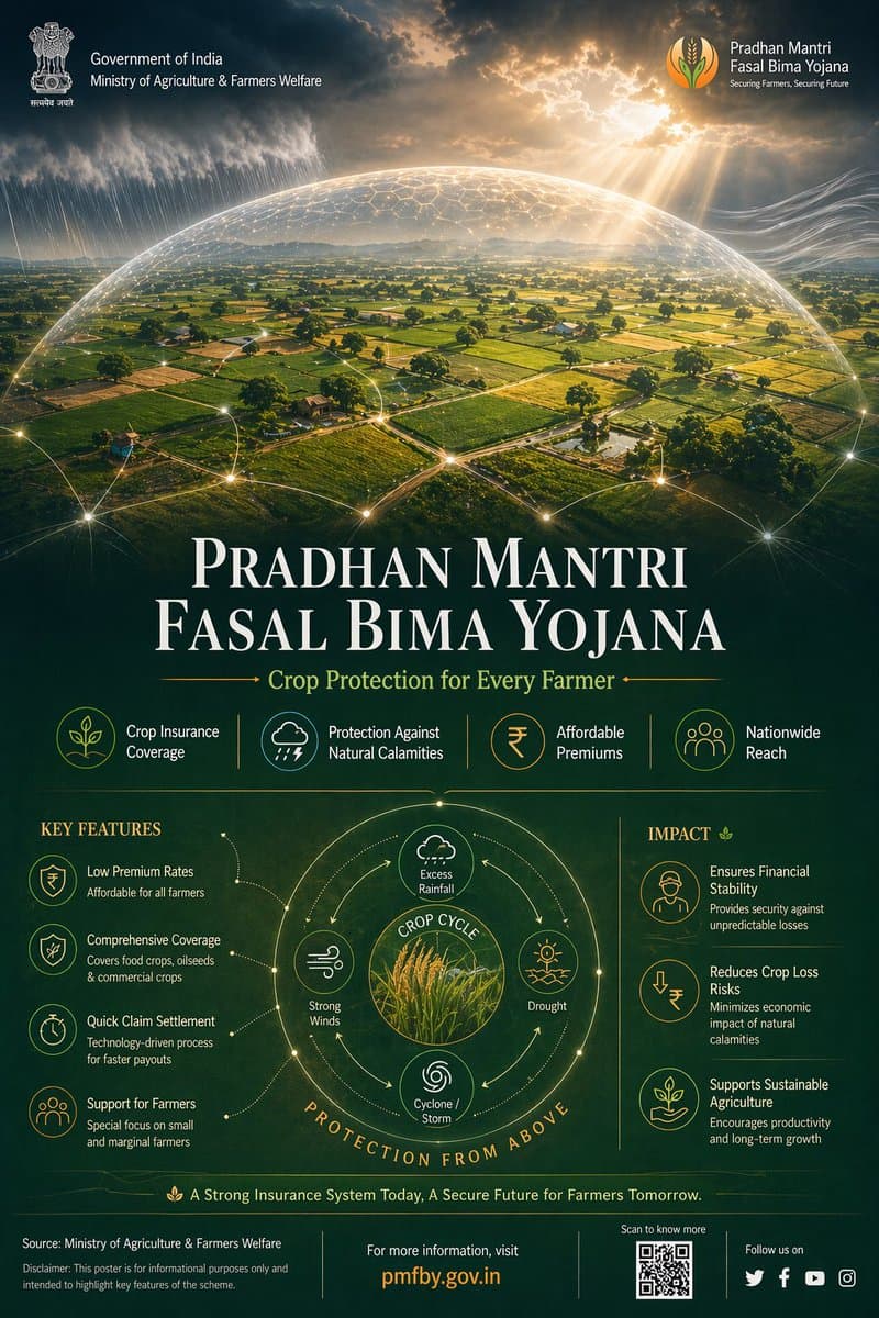
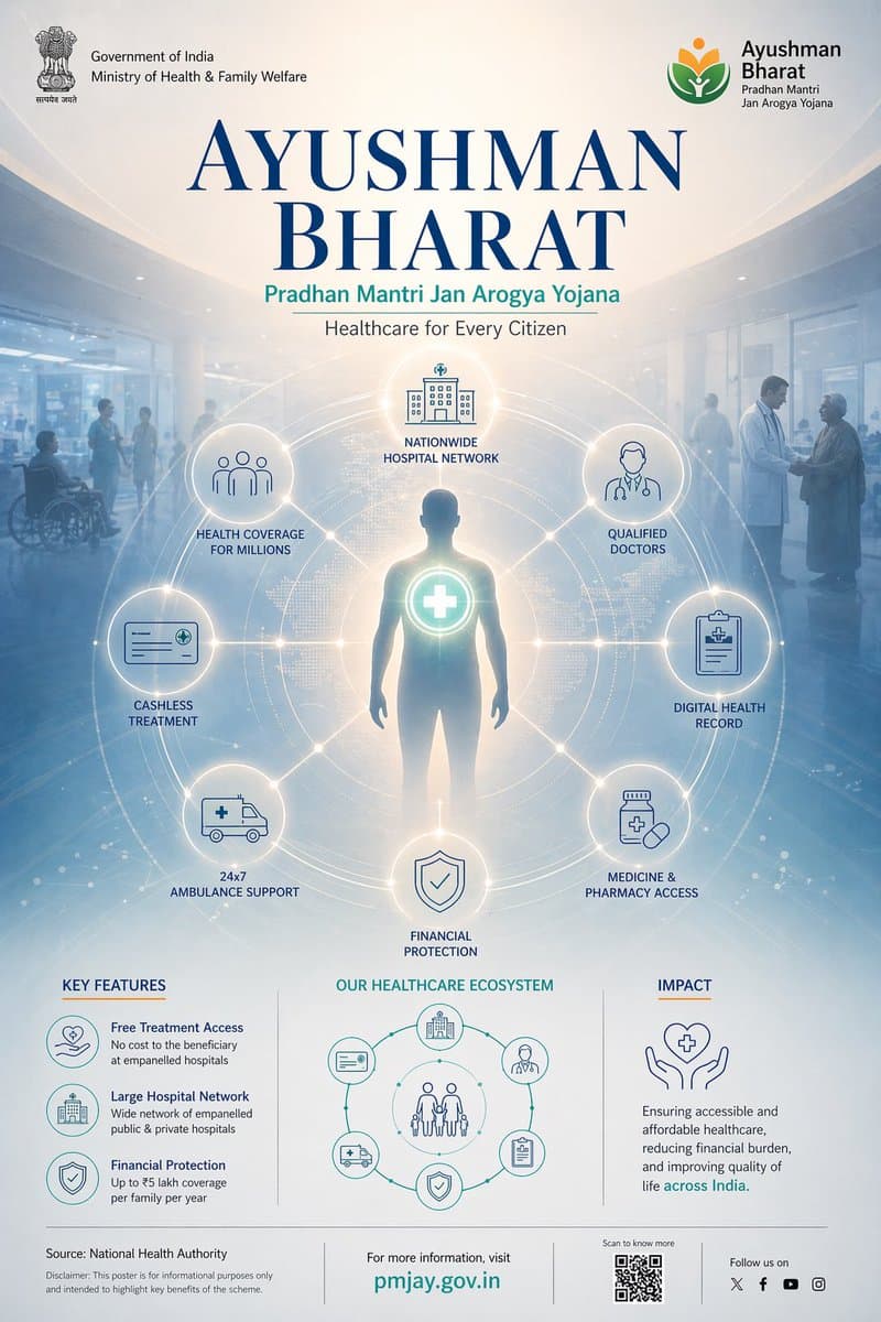
Prompt : Ultra-premium Indian Government infographic poster, 4:5 vertical format, concept-driven design titled "PRADHAN MANTRI FASAL BIMA YOJANA – Securing Farmers, Securing Future", designed in high-end editorial government communication style --- CORE CONCEPT: "PROTECTION FROM ABOVE" Agriculture visualized as being safeguarded by an invisible environmental protection system The entire layout follows a TOP → DOWN visual narrative: Protection originates from above and flows downward to farmers and crops --- LAYOUT STRUCTURE (CINEMATIC TOP-DOWN COMPOSITION): TOP 40% (DOMINANT VISUAL ZONE): Cinematic aerial view of Indian farmland - patchwork agricultural fields (green crops, golden harvest tones) - subtle rural elements (narrow pathways, irrigation lines, small huts) - realistic Indian geography (NOT western farmland) Above farmland: A semi-transparent protective dome (very subtle, premium execution) - dome edge defined by faint glowing contour lines - slight refraction effect (like glass/energy shield) - extremely controlled glow (no sci-fi exaggeration) ENVIRONMENTAL ELEMENTS interacting with dome: - rain clouds releasing water → diffused across dome surface - sunlight rays hitting dome → softly scattered - wind flow visualized using soft directional streaks These elements visually communicate: "risks are present but controlled" --- MID TRANSITION ZONE (SOFT BLEND): Gradient transition from farmland into information layer Add: - faint data lines emerging from farmland - small glowing nodes connecting different plots This creates subtle connection between agriculture and insurance system --- BOTTOM 60% (INFORMATION ARCHITECTURE): Structured like "support layers" --- TITLE BLOCK (UPPER BOTTOM SECTION): PRADHAN MANTRI FASAL BIMA YOJANA Subheading: Crop Protection for Every Farmer Typography: - Serif headline (Playfair Display style), tight kerning, high contrast - Subheading in clean sans-serif (Lato/Open Sans) --- DATA STRIP (HORIZONTAL): Minimal stat highlights: - Crop Insurance Coverage - Protection Against Natural Calamities - Affordable Premiums - Nationwide Reach Each separated with thin dividers, no heavy boxes --- FEATURE SYSTEM (ICON GRID): 4–6 minimal monoline icons: - crop - rain/weather - insurance shield - farmer - financial support Icons connected subtly with thin organic lines (not rigid tech lines) --- CENTER VISUAL (INFOGRAPHIC ELEMENT): Circular diagram inspired by crop cycle + protection - inner circle: crops - outer ring: risk factors (rain, drought, storm) - outermost layer: protection boundary Very clean, minimal, high breathing space --- IMPACT SECTION (BOTTOM RIGHT / FINAL BLOCK): Short refined text: "Ensuring financial stability for farmers, reducing crop loss risks, and enabling sustainable agricultural growth across India" --- FOOTER: Source: Ministry of Agriculture & Farmers Welfare Minimal disclaimer Optional QR placeholder --- COLOR SYSTEM (NATURE-LED PREMIUM): Primary: Deep Earth Green (#2E7D32) Secondary: Soil Brown (#6D4C41) Golden Harvest (#D4A373) Accents: Saffron (#FF9933) Soft Sky Blue (for climate elements) Background: Muted dark green / deep navy blend --- MATERIAL & FINISH: - matte textured background (paper grain subtle) - soft light gradients - minimal glow (only for dome + nodes) - no harsh contrast - realistic lighting balance --- DESIGN PRINCIPLES: - no clutter - no heavy UI boxes - organic flow, not rigid grid - emotional + informative balance - everything visually connected to farmland --- QUALITY: 8K resolution photorealistic + vector hybrid ultra sharp typography award-winning infographic aesthetic Behance feature-level quality --- NEGATIVE PROMPT: no futuristic city elements no neon glow no western farms no clutter no overdesigned UI no heavy gradients no unrealistic sci-fi shield --ar 4:5 --v 6 --style raw --q 2
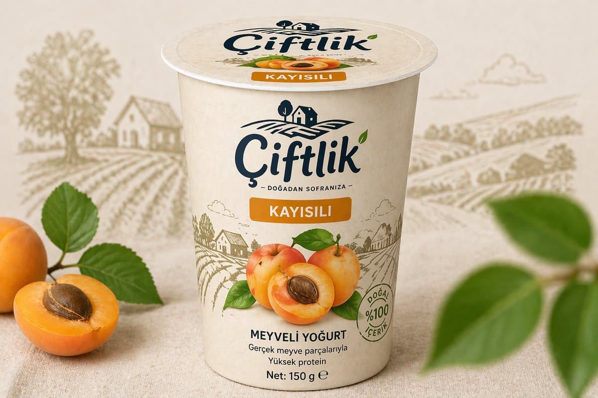
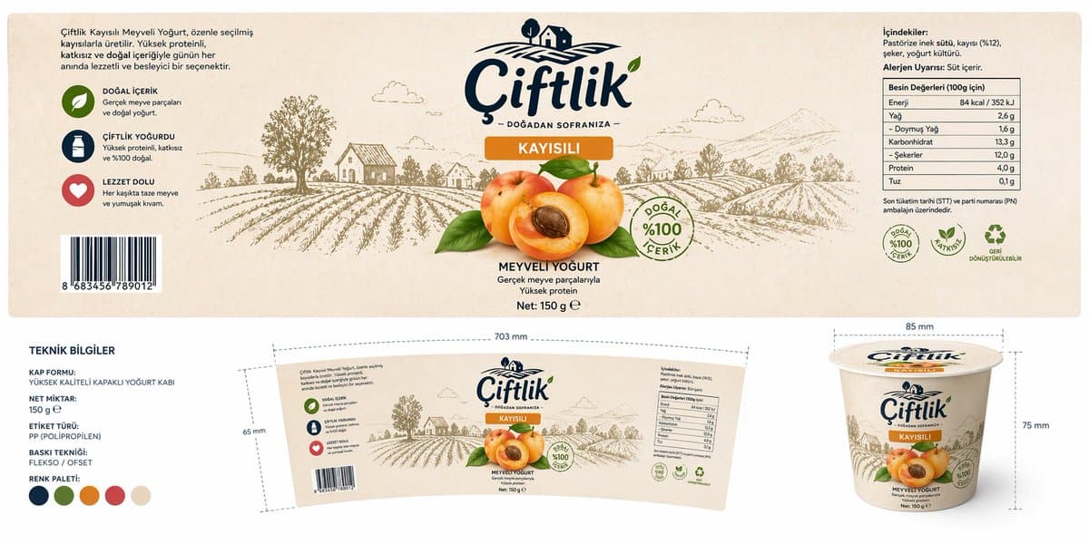
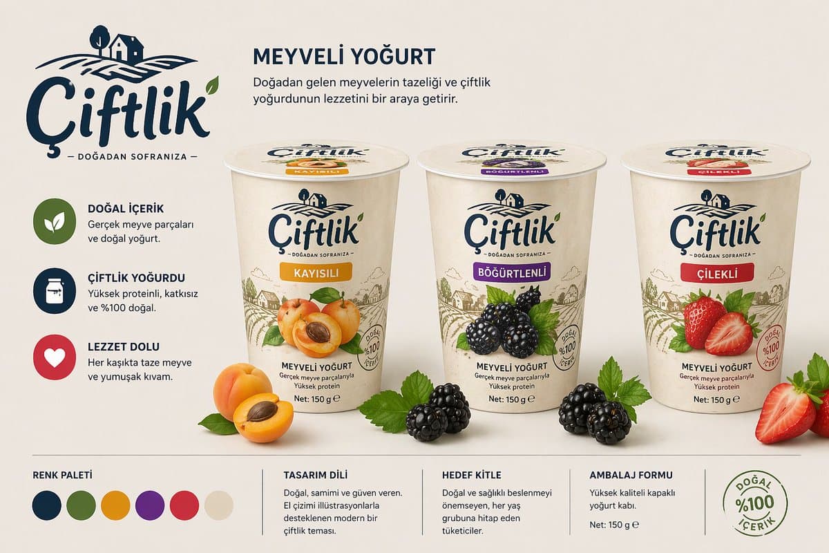
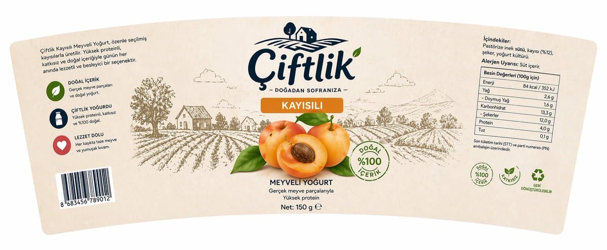
GPT Image 2 ile bir deneme daha, @ambalajca hocam gönderdi. Bu sefer print hazırlığına kadar gidebilir mi diye baktık. Meyveli yoğurt için bir marka konsepti kurmuş: Çiftlik, doğadan sofranıza. Çok başarılı :)) Ürettikleri: → Ürün mockup'ı (gerçek ortamda, meyvelerle) → Açık artwork hali (düz etiket, ölçülerle) → Ürün ailesi görünümü (kayısılı, böğürtlenli, çilekli) → Warp edilmiş etiket (kabın eğrisine uygun) Detaylar çok başarılı: → Besin değerleri tablosu (84 kcal, 13,3 g karbonhidrat, 4,0 g protein) → İçindekiler listesi Türkçe karakterlerle tam → Barkod (gerçek EAN-13 formatında) → Teknik bilgiler paneli (PP, flekso/ofset, renk paleti) → Alerjen uyarısı, STT notu, geri dönüşüm ikonu → "Doğadan sofranıza" sloganı, ğ harfi dahil hatasız Bir ajansla brief vererek haftalar sürecek bir iş, tek oturumda çıktı. Print hazırlığına kadar çalışıyor demek abartılı olmaz, gerçekten çalışıyor. Tasarım iş akışı değişiyor. Artık soru bence "AI tasarım yapabilir mi?" değil, "biz bu süreci ne kadar iyi yönetebiliriz" #GPTImage2 #PackagingDesign


Nano Banana pro on Gemini app Prompt: Ultra-realistic commercial product photography of a black matte can labeled “Oreo Blend” filled with rich chocolate latte, dramatic liquid splash frozen mid-air as creamy chocolate pours into the can, Oreo cookies and chocolate chunks flying around in dynamic motion, droplets and particles suspended in air, glossy reflections on a dark reflective surface, cinematic lighting with warm bokeh background, shallow depth of field, high contrast, hyper-detailed textures, condensation on the can, premium advertising style, 8K resolution, studio lighting, sharp focus, vibrant and rich tones. If you want, I can