AI creative prompt
Poster Design Editorial Design Prompt for AI Image
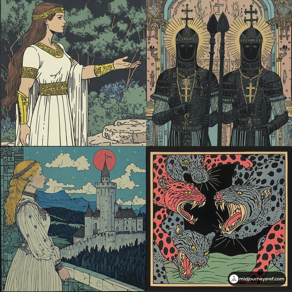
Copy and customize this Poster Design Editorial Design AI Image Prompt for your next image. Create a vertical poster composition on aged cream paper with a...
Create an RSVP Invitation Link in 2 Minutes
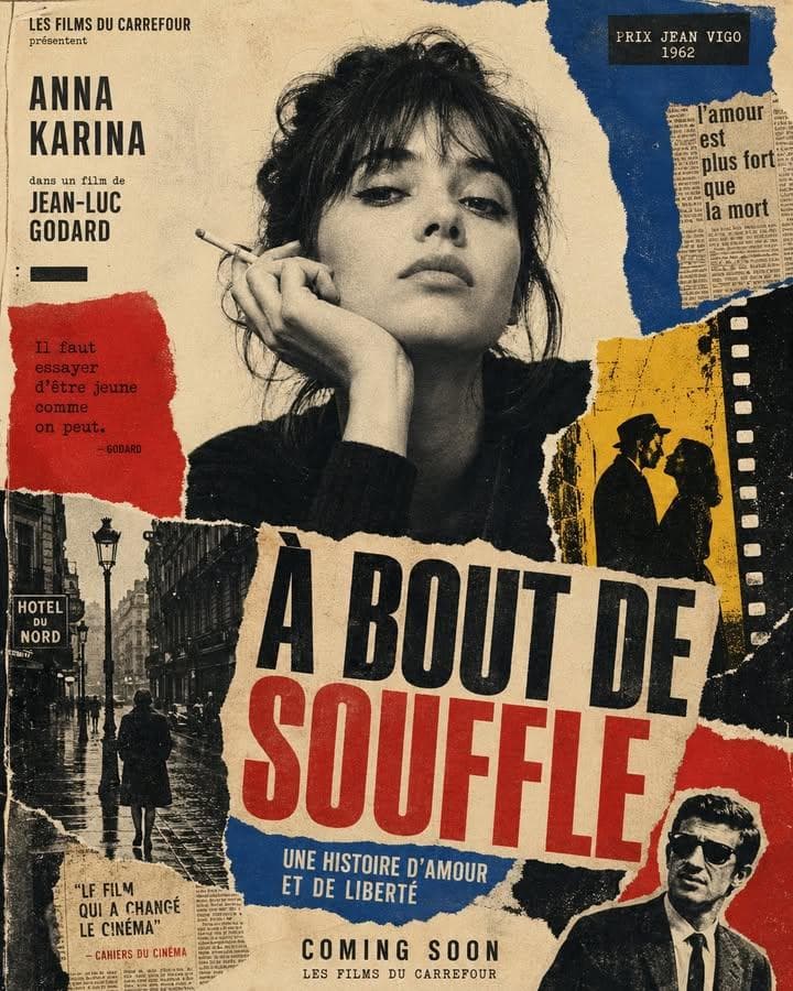
Veyvia is an elegant digital invitation & free RSVP tracking platform. Personalize templates, collect dietary preferences, and track guest lists in real time.
Explore More
Discover more high-quality prompts and get inspired by others' creativity.
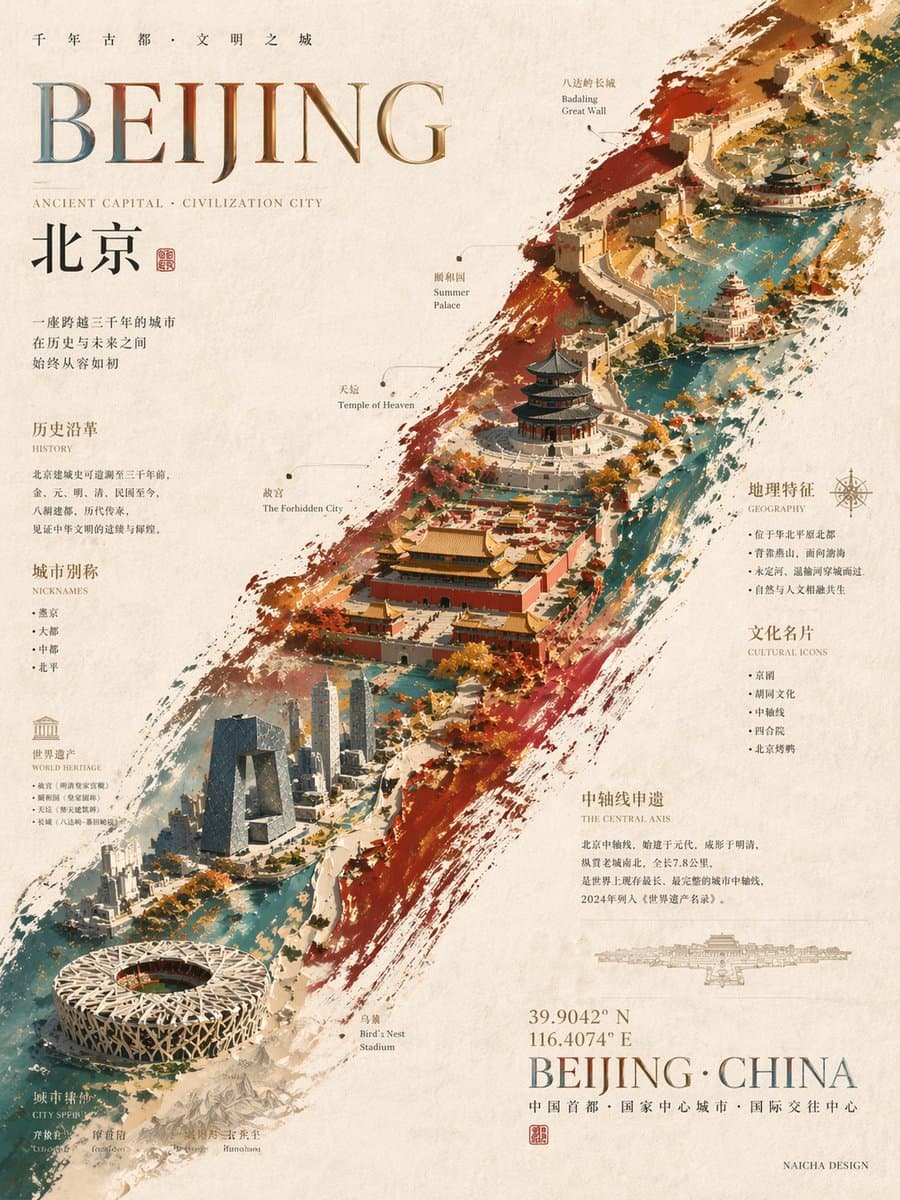
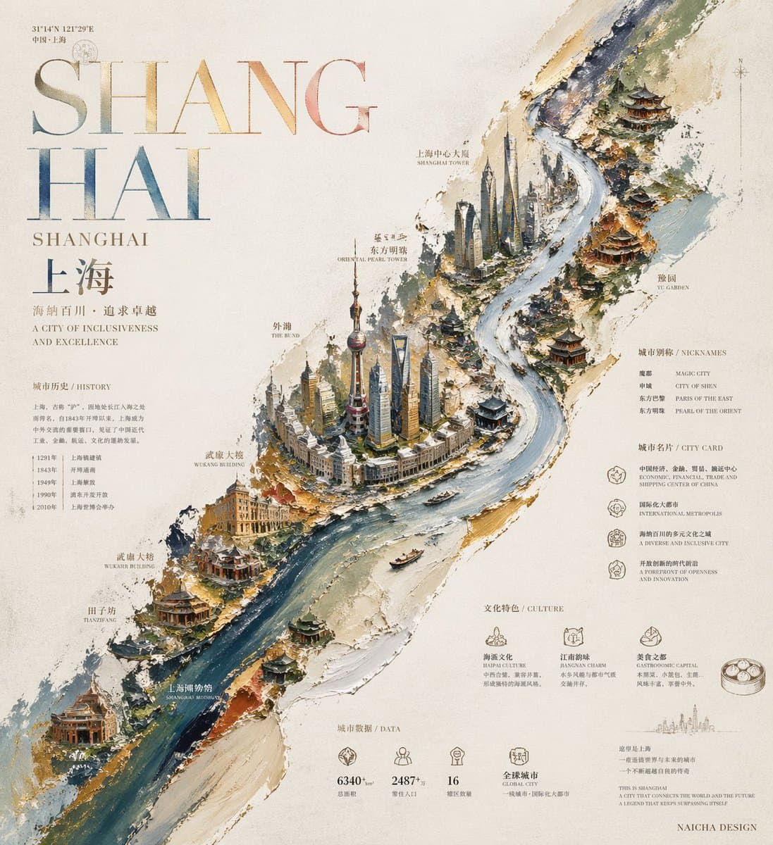
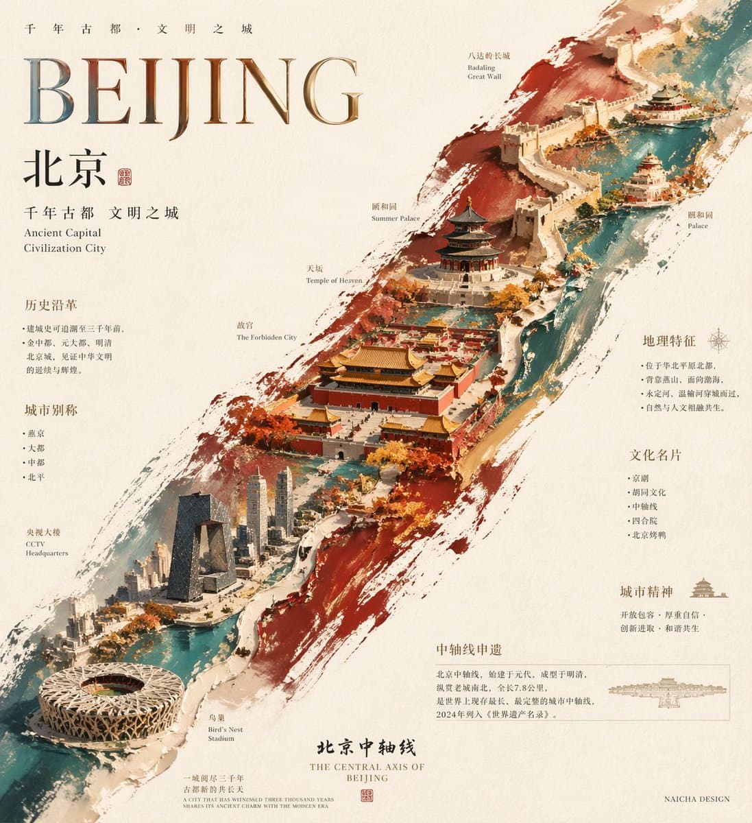
创作一张具有收藏价值、设计师海报气质与作者性审美的高完成度视觉作品。 整体风格为:油画风格 + 大师级排版文字设计。 画面需具有明显的厚涂技法质感,通过厚薄差异塑造立体感、材料感、节奏感与视觉层次,既有绘画肌理,又有现代设计感与展览级海报气质。 一、核心构图逻辑 采用居中偏斜的对角线主构图。 整张海报的核心视觉主体,不是缩在中间的一小团,而是由一条沿对角线方向大幅展开的不规则综合色带 / 图示承载区构成。 这条综合色带必须从画面一个对角方向自然延伸至另一个对角方向,形成近似贯穿全版的斜向视觉骨架,具备足够的长度、面积、张力与版面统摄力。 它必须舒展、大气、完整,不可局促,不可收缩成中间一坨,不可导致版面显得逼仄、狭窄、拘谨。 这条综合色带既像厚涂油彩横扫而成的一道主笔触,又像被提炼后的主题地貌、信息地带、文化切片或视觉载体。 综合色带的配色不能写死,必须根据用户最后输入的【城市 / 主题 / 对象 / 灵感】自动判断。 可以从该主题最典型的印象色、文化色、环境色、建筑色、情绪色中提炼出 2-3 种主色,形成高级且有层次的综合色关系。 例如可以呈现类似“紫金蓝”“赭红青”“墨绿金”“灰粉褐”等综合色逻辑,但具体色彩必须智能适配输入内容本身,而不是固定模板。 二、主体内容生成逻辑 在这条沿对角线展开的综合色带之上,承载与用户输入强相关的核心视觉内容。 如果输入的是城市: 自动提炼该城市最具辨识度的地标、建筑、名胜、水系、人文空间、历史象征、城市记忆、代表性文化元素等。 如果输入的是对象、主题或灵感: 自动提炼最有代表性的核心元素、关键场景、象征物、结构信息、文化线索、概念意象或视觉母题。 这些内容不要做成写实堆砌,不要像旅游宣传页素材拼贴,不要杂乱罗列。 必须以“极简俯视图 / 高度概括的图形化俯瞰景观 / 设计化地图感构成 / 信息化景观”的方式进行整合。 让它们像被压缩、提炼、嵌入在这条对角线综合色带之中,形成统一、克制、连续、有秩序的主图示系统。 图示区域内部必须具有连续性、流动性与整体性,让不同元素沿对角线方向自然展开、串联、过渡、呼应,形成类似视觉长卷般的观感。 不要中间挤、两头空,不要让主体断裂,不要把视觉重点缩在局部。 三、背景与留白 背景统一为米白色、暖白色或带轻微旧纸质感的纹理纸质背景。 纸面要有自然纸张纤维感、细腻颗粒感、轻微手工纸或高档印刷纸肌理。 整体背景必须干净、克制、安静,不要过度装饰,不要复杂花纹干扰主体。 必须保留大面积留白,但这种留白不是空洞无力,而是服务于对角线主结构的高级留白。 留白应让主体更突出,也让文字排版拥有足够的呼吸感、空间感、展览感与版式张力。 四、文字系统与版式逻辑 文字系统必须是整张海报的重要组成部分,而不是后贴上的说明文字。 整体文字原则上采用衬线体系统,体现高级、克制、经典、文化感、设计感兼具的大师级排版效果。 标题、主文案、副文案、知识点信息、小标注、注释性小字之间必须有清晰层级,并通过字号、疏密、错落、对齐、留白、聚散、呼应来形成真正的版式节奏。 必须明确版式优先级: 沿对角线大幅展开的综合色带 / 图示主体,是整张海报的第一视觉骨架与主叙事通道,优先级高于普通文字排版。 这条对角线主体必须保持连续、完整、舒展、不断裂。 所有大标题、拼音 / 英文大字、知识点模块、装饰文案、说明性文字,都必须服从这条对角线主体的完整性。 不得从中间横向切断主体,不得把主体拦腰打断,不得在主体最关键的连续区形成明显遮挡或割裂。 必须为对角线主体预留一条完整、清晰、连续的视觉通道。 文字系统应主要分布在主体两侧的留白区、四角留白区、边缘排版区,或沿主体边缘顺势排布,而不是粗暴压在主体中段中心。 若主体内部确实需要少量文字,只能是极少量、低干扰、嵌入式的小标注,例如局部名称、地标注释、小型标签等,并且必须顺应主体内部结构自然嵌入,不可形成大面积横截式排版。 五、拼音 / 英文大字的材质与配色 海报中必须加入一个“拼音 / 英文大字标题”,作为核心视觉文字之一。 如果用户输入的是中文城市、中文主题或中文对象,则自动提炼其拼音作为大字标题; 如果输入内容更适合英文表达,也可自动生成对应英文大字标题。 这个大字标题必须具有明显的烫印质感、金属材质感、箔印感或压印感,呈现高级、细腻、克制、具有印刷工艺美感的材质效果。 它可以带有轻微反光、压痕感、浮雕感、箔面质感、纸面烫印质感,但不能俗气,不能廉价,不能过度炫光,不能显得商业化过强。 这个材质大字的颜色方案不能被锁死为单一纯金色。 它必须根据用户输入的【城市 / 主题 / 对象 / 灵感】自动判断,灵活选择更适合的材质色彩方案,以避免画面在这部分显得死板、僵硬、单调。 可采用以下两种灵活方案之一: 方案一:统一单色 选择一种最能代表该城市 / 主题气质的材质色。 这个颜色可以是金、古金、铜金、香槟金、玫瑰金、银、铂金、墨金等金属色; 也可以是带有金属材质感的其他颜色,例如金属蓝、金属绿、金属紫、金属红、灰银蓝、青铜绿、暖棕金、墨黑金属感等。 重点不是“必须金色”,而是“具有高级材质语言”。 方案二:综合色综合搭配 使用 2-3 种彼此协调的颜色进行综合色搭配。 这些颜色可来自该城市 / 主题的主色调、印象色、建筑色、自然色、文化色或情绪色,并通过彩色箔印、异色箔印、局部异色、综合色金属层次等方式呈现。 这种综合色方案必须高级、克制、有设计感,不要做成廉价渐变,不要花哨,不要破坏整体气质。 无论采用单色还是综合色方案,都必须让拼音 / 英文大字在材质上有“烫印感”,在颜色上有“主题感”,在视觉上有“灵活性”,并与对角线主体及整体版面形成统一关系。 这个拼音 / 英文大字不能孤立存在,也不能横插进对角线主体中央把主体切断。 它应作为整张海报的版式支点,布置在留白区、主体外缘、边缘排版区,或顺应整体版面气流展开,与主体形成呼应关系和排版张力。 如果同时出现中文标题与拼音 / 英文大字,则要形成清晰而高级的层级关系: 拼音 / 英文大字可作为主要视觉标题; 中文标题可作为呼应性标题、副标题或辅助排版元素; 两者需经过精心编排,绝不能简单上下堆叠。 六、四周信息与知识点 四周内容不能空泛,必须围绕主题自动补充“有亮点、有知识点、有阅读价值”的信息。 这些内容由模型根据用户最后输入自动决定,不需要用户额外提供。 如果是城市方向: 自动补充该城市相关的别称、历史定位、文化标签、地理特征、代表性建筑、名胜注释、人文亮点、城市精神、典型符号、简明知识点等。 如果是对象方向: 自动补充其功能、材料、结构、来源、用途、文化背景、代表性特征、技术点等。 如果是抽象主题或灵感方向: 自动补充其概念提炼、风格关键词、象征含义、背景知识、延展性亮点、联想线索等。 这些知识点不要机械罗列成说明书,不要一股脑堆满边角。 必须以设计性的方式拆分、分组、穿插、整合、排布,成为画面的一部分。 它们应围绕对角线主体自然分布在四周留白区中,形成既有信息性、又有装饰性的版式结构。 四周信息应采用“避让式排版”,围绕主体边缘自然展开,形成环绕、陪衬、补充关系,而不是侵入主体中心通道。 信息块之间要有疏密变化和呼吸感,做到丰富但不挤。 七、署名 在画面右下角保留一个极小号署名字样: “NAICHA DESIGN” 署名字体要克制、干净、低调,不喧宾夺主。 八、整体气质目标 整张海报应呈现以下综合观感: 主体舒展、版面开阔、对角线主结构完整铺开; 留白高级且有呼吸感; 信息丰富但不杂乱; 远看有鲜明主视觉与强烈记忆点; 近看有丰富的知识点与排版细节; 兼具绘画性、设计性、信息性、阅读性与收藏感; 像一张高端展览海报、城市视觉海报、设计年鉴封面或艺术书籍内页级别的作品。 九、避免的问题 不要把中间图示区域缩成一坨; 不要让主体面积过小; 不要让对角线主图示被大字或信息模块拦腰切断; 不要让主体中段被标题横插打断; 不要让拼音 / 英文大字像路障一样压断主体; 不要让版面显得狭隘、逼仄、拘谨; 不要模板化旅游宣传页感; 不要低级拼贴感; 不要普通地图截图感; 不要说明书式排版; 不要廉价插画感; 不要满版塞满元素; 不要让文字沦为附属说明; 不要让材质大字显得俗气、死板、单调或商业化过强。 十、最终目标 要让“沿对角线大幅展开的综合色带主体 + 极简俯视元素 / 图示系统 + 具有烫印 / 金属材质感且颜色灵活的拼音 / 英文大字 + 四周知识信息 + 高级衬线排版 + 大面积留白”共同形成一张完整而高级的作品。 最终让整张图: 远看有强烈主视觉冲击, 近看有丰富阅读内容与设计细节, 主体不断,文字不截流,版面大气,排版高级, 整体具有收藏价值、作者性与大师级审美完成度。 用户最终输入: 【城市 / 主题 / 对象 / 灵感】:_____ 尺寸要求:_____ (比如3:4)
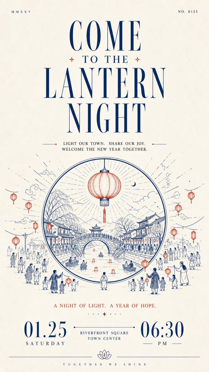
Build a restrained, solemn paper-based informational design with human warmth around any chosen thematic subject: let large areas of bright white space first establish quiet order, then let a striking headline, line-drawn narrative, and bottom numerals carry the reading onward in sequence. Organize clearly differentiated modules along a single main reading axis: near the top, place one extremely small, thin, widely letterspaced auxiliary text or numbering group on each side, separated by remote spacing to create slight asymmetry; beneath them, set an oversized, high-contrast Latin serif headline extending horizontally, with strong contrast between fine hairlines and thick stems, elongated letterforms, sharp terminals, and the same accent ink as the core illustration; then add a centered group of short Chinese phrases on the theme, built on a slender Songti skeleton with generous line spacing and breathing room between characters, so the dark text block both carries the headline and builds momentum toward the illustration. Distill the thematic subject's core image and its relationship to the environment into a monochrome printmaking-style line drawing rather than reproducing fixed objects: build outward spatial movement from the center with clear outer contours, continuous arcs, layered paths, and a few flat fills; keep foreground lines longer and more open, make the middle forms the heaviest, and finish the distance with fine short strokes; alternate dense detail with large expanses of empty paper, keep the contours legible, allow slight hand-drawn variation in line weight, and preserve the soft, blunted edges created by ink absorption at corners of a printed mark, so the image has a monumental stability without feeling heavy. Place the most important short notice phrase below the illustration, then anchor the bottom visual weight with a group of oversized, high-contrast numerals or equally scaled key information, spreading the left and right information apart and connecting the center with an ultra-fine horizontal line and small text, so the extreme scale differences create the ceremony of a formal announcement; finish with a hairline rule running across the bottom edge, lifted at its center by a small symmetrical emblem derived from the theme, and set a micro Latin wordmark beneath it with extremely wide letterspacing for a quiet, precise ending. Derive the color adaptively from the theme: the theme's meaning decides the specific hue and warm/cool character of the accent, which should stay medium-high in saturation, clean, and slightly pigment-like, occupying roughly one-tenth to two-tenths of the image and concentrated in the large headline, core line drawing, and bottom fine lines; give the background a near-white, low-saturation paper color that harmonizes with the accent, lets it dominate the composition, and keeps it high in lightness; use a near-black with the same warm/cool tendency for body text and numerals, limiting it to the typographic skeleton and local contrast. Keep an asymmetric area contrast rather than an even color balance: the more vivid the accent color, the more restrained the paper and the fewer, more precise the dark areas. Render the surface as fine uncoated paper fiber with slight uniform grain and a soft scanned feel; keep the texture mainly on the blank paper and visible through thin layers of ink, allow only tiny tonal variation in solid areas, and avoid heavy stains, strong creases, gloss, dimensional shadows, or decorative gradients; the whole design should remain bright, airy, and slightly edged by the paper's ink absorption, preserving the order among white space, line drawing, typographic scale jumps, and bottom closure, while preventing the illustration from expanding and squeezing the information or the text from averaging out and losing rhythm.
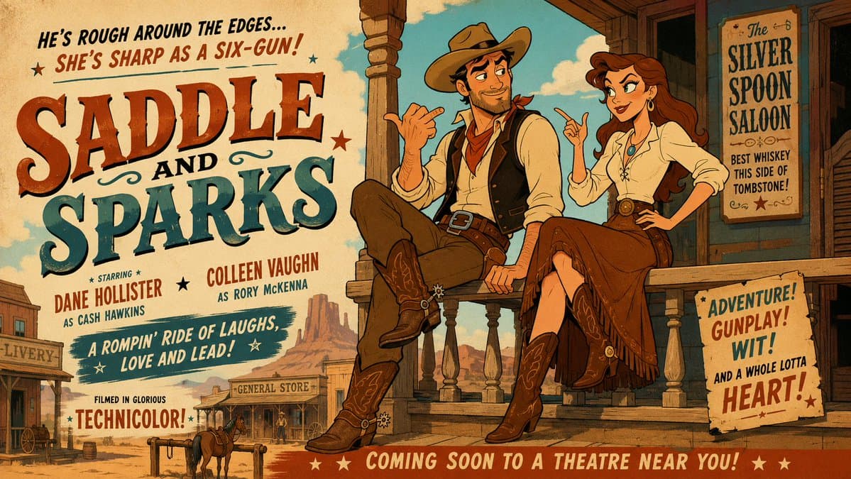
"Mid-century theatrical cartoon still promotional Hollywood movie trailer banner featuring a rugged cowboy with a short beard and steady gaze, wearing a classic western shirt, vest and cowboy hat, and a bold frontier woman with long chestnut hair and a determined smile, wearing a practical blouse and riding skirt, seated on a wooden porch railing outside a dusty saloon. Stage them in a lighthearted, spirited, good-humored interaction, with both characters fully visible, relaxed, and clearly reacting to each other with playful tension. Design the figures with exaggerated early-1950s animation caricature: clean black contour lines, sharply simplified anatomy, elegant angular silhouettes, expressive eyebrows, stylized facial shapes, graceful hand gestures, and cheerful readable expressions. Render the entire image in a unified traditional cel-animation aesthetic, with the background following the same stylized visual language as the characters, using flat opaque colors, minimal hard-edged shading, simplified furniture and décor, subtle hand-painted texture, controlled perspective, and crisp theatrical staging. Use a dusty western palette of warm sand, deep brown, soft turquoise, and cream and maintain a witty, charming, visually snappy mood."